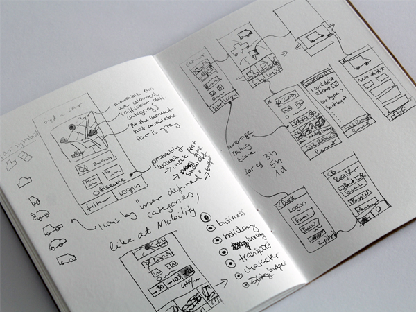
Visual presentation of available cars at user’s area (to present and convey availability)
Usage categories based on well-understood user needs and goals (such as holiday or showing off). Properly name and show these categories and offer filter
Visually descriptive car icons for different categories (using them on the map as well)
Currently unavailable cars with another color
e.g. 3 visible price categories
Easy, short, fast, delightful registration, avoid confusing factors
Prevent breaking the registration flow
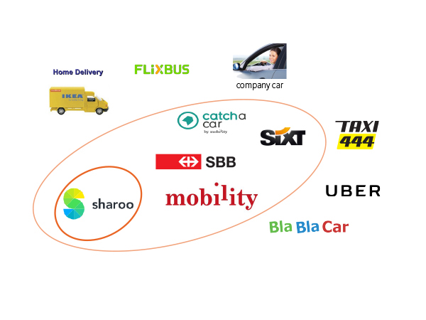
Market Research, Competitor Analysis, Benchmarking
Studies Research
User Research
POV, HMW
Personas
User Journeys
Ideation, Concept Sketches, Prototypes
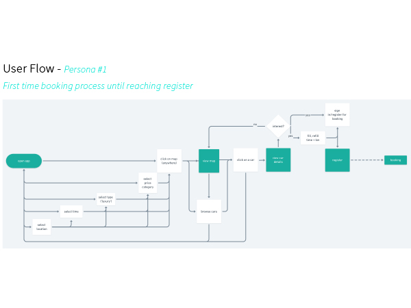
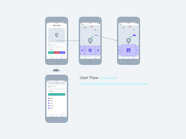
User Flows
Wireframes
[email protected]